Sorry, the video is currently unavailable.
Adding a Webpart to a Page
The ability to place and rearrange webparts on a webpage allows the user to easily build and structure their website in a countless number of ways. This document explains the functionality of webparts, how to create, configure, and implement webparts on a webpage.
Once content has been created within the CMS it is delivered through the use of webparts. Each webpart has its own unique properties and behaviors and they share some basic properties.
At the top of the universal nav, toggle the Page Mode to Webpart. When Webparts mode is selected, the webparts menu will display, which allows for the addition of content to a webpage via specific zones.

- In the Webpart dropdown menu, select a webpart (i.e. n4m Content HTML Snippet) and in the Zone dropdown, select Content Zone.
- Now, click on the Add button to the right of Zone.
- Your webpart will now be placed on the page.
Add all webparts to the various zones based on page template and need.
For more information regarding the different zones on a page, please refer to our Sitemap: Page Templates

The webpart properties are accessed by hovering over the gear icon in the top right corner of any webpart. This displays a list of three options: webpart properties, Publish/Un-publish, and Delete. The Properties window is split into two tabs with different sections:

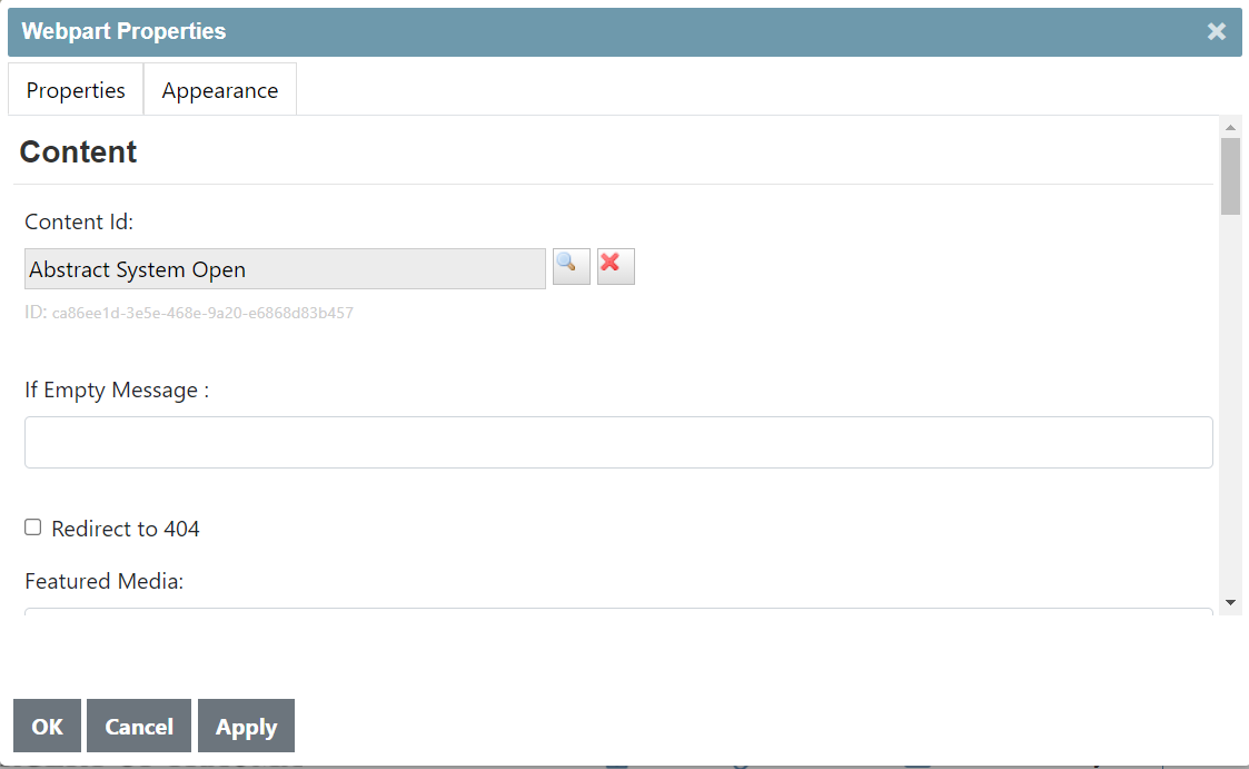
- Content - if applicable, allows administrator to define which content is displayed
- Display - contains certain appearance settings, used with the Appearance tab
- Google - contains settings that allow Google to crawl content within a webpart and can enable metadata to be injected into a page’s header, used for SEO
- Next / Previous Navigation - if applicable, enables or disables navigation buttons from appearing and the label of those buttons
- Paging - if applicable, provides settings to change the behavior and appearance of paging functions, typically used to display different numbers of content in lists
Appearance Tab

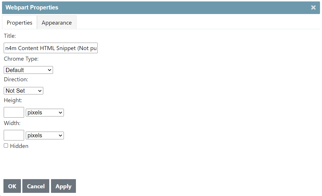
- Title - the same value as the title in the Display Properties tab
- Chrome Type - webpart appearance properties: Title, Border, Both, or None
- Direction - controls alignment of content; Left or Right, defaults to Left
- Height - controls the height of a webpart with various measurement options (such Pixels, Millimeters, Percent, etc.)
- Width - controls the width of a webpart with various measurement options
Note
Use of these settings is discouraged with the exception of Title and Chrome Type to avoid improper appearance of webparts.
Display Properties (Common)
| Name of Field (* = required field) |
Type of Data |
Description of Data |
| Published |
Checkbox |
Checking this box publishes the webpart, making it visible to end users |
| Title URL External |
Checkbox |
Checking this box makes the title of the webpart, if enabled, an external hyperlink |
| Title |
Plaintext |
If enabled, this displays as the webpart title |
| Title URL |
Plaintext |
If enabled, the displayed webpart title will link user to this URL when clicked (full URL should be used, including http:// or https://) |
| CSS Class |
Dropdown List |
Determines the CSS style applied to the webpart, customized per client; includes five default options: None, Card, Grid Listing, Spotlight Overlay, and Spotlight Split |
| Display Page Tools |
Checkbox |
Checking this box adds a “send email” link to the webpart |
| Has Print Capability |
Checkbox |
Checking this box adds a “print page” link to the webpart |
| Has Font Size Capability |
Checkbox |
Checking this box adds a button to increase or decrease the font size of the webpart |
| Enable Sharing Tools |
Checkbox |
Checking this box displays a social media sharing pane for the content within the webpart; intended only for content detail webparts, and only functions on one webpart per page |
Preview Mode

You may preview changes made to your site prior to publishing them by using Preview Mode. Locate the Preview button in the universal nav to the right of the Page Mode and toggle it On.