This article is the second part of our series on writing for the web.
Remember the days of sprawling novels dominating your attention? In the lightning-fast world of the web, those days are gone. Today's readers are scanners, not settlers, flitting from headline to bullet point, seeking information efficiently. So, how do you transform your content into a user-friendly feast they can devour in bite-sized chunks? Dive into the art of scannable writing!
Bite-Sized Chunks & White Space
Imagine staring at a wall of text. Not inviting, right? Break it down!
- Aim for short paragraphs, ideally 2-3 lines, making key points easily digestible.
- Embrace bullet points and numbered lists to visually chunk complex ideas.
- Don't underestimate the power of white space! Generous margins and line spacing create a clean layout, guiding readers' eyes effortlessly.
- Use tables to make complex information easier to understand and images or diagrams representative of the ideas in the content.
Headings: Signposts for Your Content
Think of headings as signposts on a journey.
- Clear, concise headings instantly inform readers about each section's main point.
- Use descriptive subheadings to offer intriguing glimpses into sub-topics, piquing interest and guiding navigation.
Remember, a well-structured text with heading hierarchy (H1, H2, H3) is like a well-organized map, easy to follow and explore.

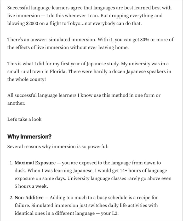
The following writing for the web principles can be found in this example article: short paragraphs, white space, clear and concise headings, and bullet points and numbered lists.
https://medium.com/educreation/how-to-learn-languages-faster-with-simulated-immersion-f393c3631f2c
Boldly Highlight the Important Bits
Not all information is created equal. Use visual cues to draw attention to the most crucial bits.
- Bold keywords and key points make them stand out, aiding comprehension and scannability.
- Sprinkle in quotes and pull quotes to highlight impactful statements or statistics, breaking up text and grabbing attention.
Don't forget clear, contrasting-colored call to action links inviting readers to engage further.

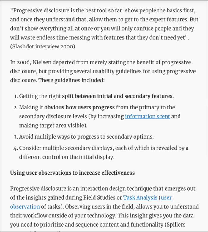
This example article makes use of quotes and pull quotes, bold keywords and key points and call to action links.
https://www.interaction-design.org/literature/book/the-glossary-of-human-computer-interaction/progressive-disclosure
Remember, scannable writing is about clarity, conciseness, and visual guidance. By implementing these tips, you transform your web content into a user-friendly feast, inviting readers to dive in and devour the information you have to offer, bite by bite!
Stay tuned for our next article in this series where we'll discuss common writing pitfalls and tips on how to overcome them!
Boost your writing skills with our expert-led web writing training!
Whether you're an individual seeking to polish your personal brand or a team aiming to create engaging website content, we have the perfect program for you. Contact us to learn more about custom training opportunities.